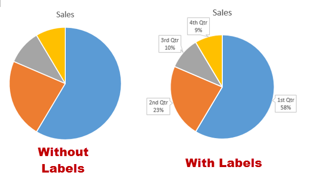
When you insert a pie chart in an Office program, you may notice that the data labels are missing from the chart. The missing data makes it tricky to identify which slice of the chart has the biggest proportion. Luckily, it is possible to show the data labels on the chart. This will work in PowerPoint, Excel, or any other Office application that supports charts.
With our example of two pie charts, one without labels and one with labels enabled, we can clearly see that the chart which includes labels is more useful. It helps the reader quickly compare the proportion of the slices and identify the trend from the chart. To build a better presentation, showing data labels on a pie chart is recommended.
This will typically be done in Excel or PowerPoint, but any of the Office programs that supports charts will allow labels through this method.
1. Launch PowerPoint, and open the document that you want to edit.
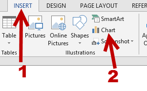
2. If you have not inserted a chart yet, go to the Insert tab on the ribbon, and click the Chart option.
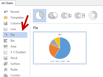
3. In the Chart window, choose the Pie chart option from the list on the left. Next, choose the type of pie chart you want on the right side.
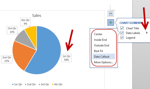
4. Once the chart is inserted into the document, you will notice that there are no data labels. To fix this problem, select the chart, click the plus button near the chart’s bounding box on the right side, and check the Data Labels option.
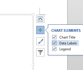
5. Now, data labels will show up inside the slices of the chart. If that is not what you want, you can change the position of the labels by clicking on the small arrow next to Data Labels and choosing one of the available options from the list. You are allowed the place the labels at the Center, Inside End, or Outside End of the chart, or you can just choose Best Fit to let the program decide the best position for you. You can hover over each option to see the changes to the labels in real-time.
