Inserting sparklines next to your data set provides a simple way of viewing a trend for a set of data points. Sparklines are tiny, free-flowing graphs with no axis or labels.
One of my favorite tricks for identifying trends is through the use of sparklines. Below is a simple data chart that I completely made up in Excel to illustrate this tutorial. By looking only at the data for each month, it is not very easy to visualize the trend of the data; however, sparklines make visualization much easier.

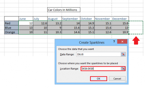
1.First, select all of the data that you want to have on your sparklines. 
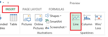
2.Once all of the desired data has been selected, choose the INSERT tab, and then select Line from the sparklines choices. 
3.Now, you can either manually enter the desired position of your sparkline, or you can click and drag to select an area. Please note that the sparkline can only take up one cell, so if you highlight more than one cell in width, you will receive an error message. When you are satisfied with your range, click OK to save your settings and display the Sparklines. 
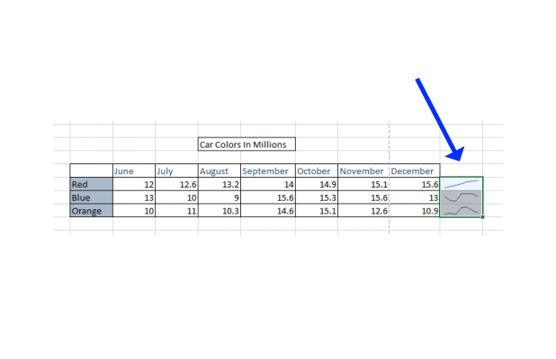
You can now see a trend line next to each set of data. This gives a highly compact and efficient method for visualizing your data.

