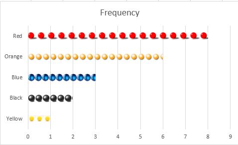
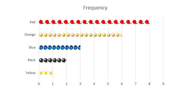
A pictograph is a graphs that is created with pictures of the represented object instead of bars or lines. They provide interesting and unique ways to present data and can be created in Excel using these directions.
The directions and examples here were generated from Excel 2013. However, pictographs can be created through a similar process in Excel versions 2007, 2010, and 2011.
1. Start up Excel 2013.
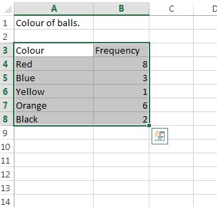
2. Title the A3 and B3 column Colour and Frequency accordingly.
Pictographs most often deal with categories and frequency. In our example, color will be the category on the x-axis and ball frequency will be on the y-axis.
3. In the Colour and Frequency columns input your data.
4. Select the cells you wish to graph. For our example we will select A3 through B8.
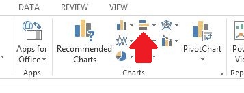
5. Select INSERT from the top tool bar.

6. Click on Insert Bar Chart, and select Clustered Bar, from the 2-D Bar Section.
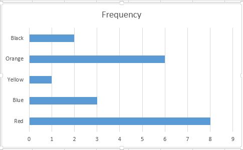
7. By now you should have something that looks like this. Right Click on one of the Bars and select Format Data Series… from the drop down menu.
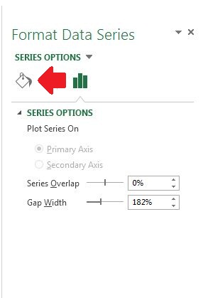
8. Select Fill and Line from the Series Options.
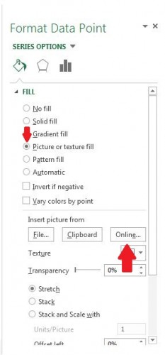
9. Select Picture or texture fill, and then from the Insert picture from heading select Online… Alternatively, you could pick a local image file to use instead.
10. The Insert Pictures window will appear. Search for the image most applicable to the category of your graph. Since in this example we are talking about ball colour, we will search for a red ball.
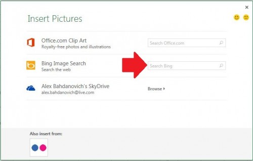

11. After finding an appropriate image, select it and click Insert.
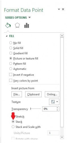
Now, you may have a visually displeasing, stretched image. To fix this select Stack from the Fill option.
12.Our chart is now starting to resemble a pictograph.
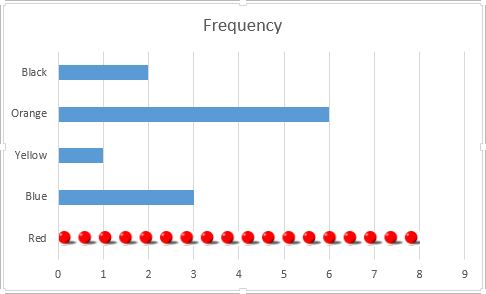
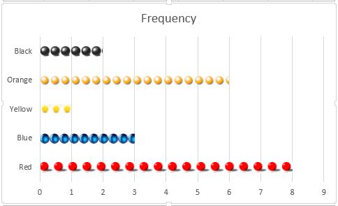
Repeat step 11 for the remainder of the bars.
13.Normally, pictographs are arranged from largest to smallest. Select the cells in our frequency column.
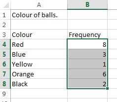
14. Right-click, and select Sort –> Sort Largest to Smallest.
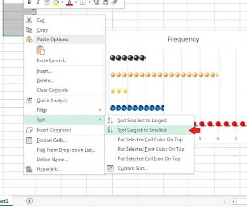
15.Your finished product should be a pictograph.
