Google Sheets makes creating basic graphs easy. In fact, it suggests graphs for you when you highlight tables of data. You will find that the interface of Google Sheets is different from Excel, and Google Sheets also does not have as many in-depth options as Excel. However, you can still create visually impactful graphs with features that allow you to change graph colors quickly and intuitively. Picking a good color scheme for your charts is a great way to reinforce your brand. Here’s how to do it with Google Sheets.
Changing Colors in Previously Created Graph
1.Click on your graph. Symbols of an eye and a pencil will appear next to the graph. Make sure that the pencil, or quick edit mode, is toggled on. (Note: The eye symbol is view mode. Switch it to this after the chart is finished to prevent yourself or others from accidentally editing the chart.)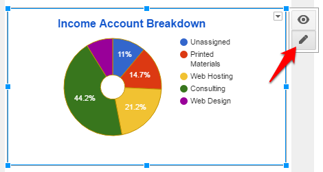
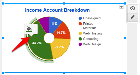
2.Click on each series to show the color options. Pick your new color from the list. Do this again for each series in your graph.
3.If your graph is a bar, line, or similar chart, selecting one instance of the series will highlight all the rest. Color changes will be applied throughout the graph.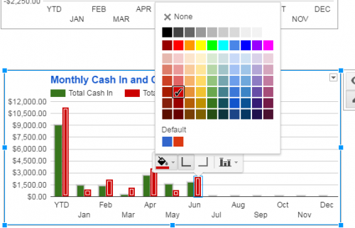
Setting Colors as You Create a Graph
1.Highlight the cells you want to use as your data. Then go to Insert>Chart, or click on the Explore icon if it is green in the bottom right of your screen. Choose the type of chart you want from the recommendations, and then navigate to the Customization tab in the Chart Editor window.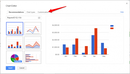
2.Scroll down to the Series section. Choose one of your series from the drop-down menu, and then choose the desired color of that series. Repeat until all the series are colored to your liking. Click Insert to add the chart to your spreadsheet.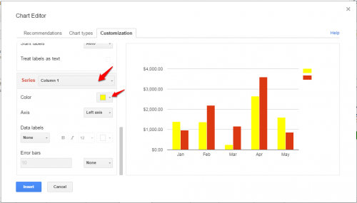
Do you need more Google Sheet tutorials? Leave a comment with a topic that you want to learn more about, and I will see if I can help you out.
