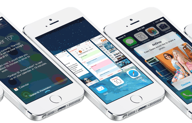
The new flat design in iOS 7 is a welcome change, but for many users, the style is not suitable for their tastes. Beside revamping the interface for all system apps, many interfaces like Control and Notification Center now have a translucent background which exposes the color of the content behind them.
Like the flat icon design, the translucent background is also one of the most controversial changes in iOS 7. Because the translucent background’s color depends on the Home screen’s background and the icons beneath it, it may make the whole interface very inconsistent and distract the users from the main content.
If you do not like it, follow the steps in this tutorial to disable it and change the background to a solid color.
1. Tap on the Settings icon.
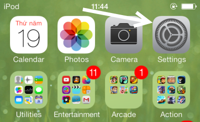
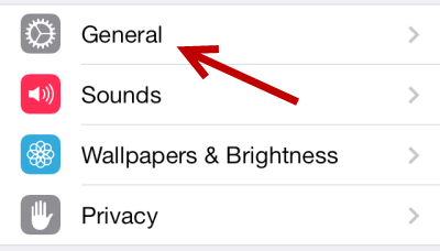
2. When the Settings section is loaded, continue by choosing the General section near the top of the screen.
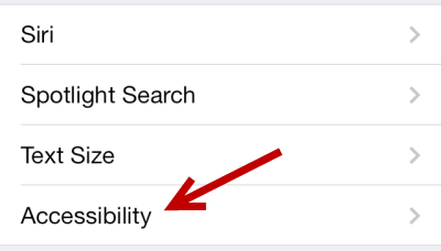
3. Next, scroll down the page and choose the Accessibility option.
4. In the Accessibility page, under the Vision section, find the Increase Contrast option. Tap on it to change the setting.
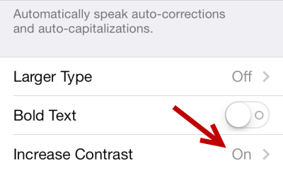
Move the slider to the right side to turn it on.
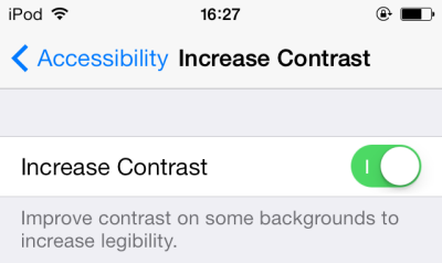
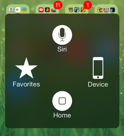
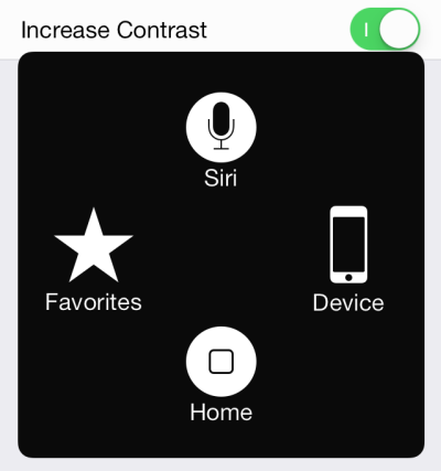
5. By turning the Increase Contrast option on, the background of the Assistive Touch, Unlock page, Control Center, and Notification Center will be switched to a solid color instead of the translucent background. Below are the before and after pictures of these features.
Assistive Touch Default Style
Assistive Touch with Increase Contrast option
Control Center Default Style
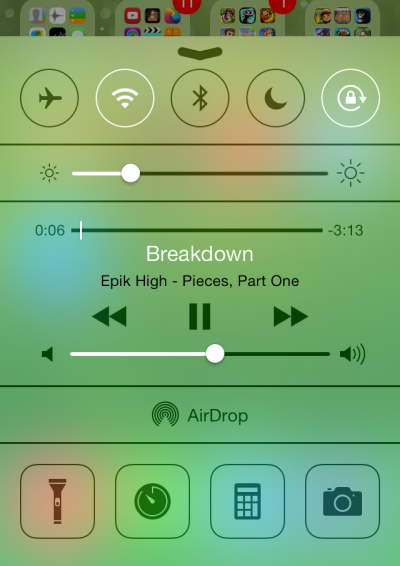
Assistive Touch with Increase Contrast option

Notification Center Default Style

Notification Center with Increase Contrast option
