After you upgrade your Mac to OS X Yosemite, you will find the visuals of the system to be one of the biggest and most noticeable changes. Every part of the system has been transformed to a more modern, flat look. Besides the new system program icons, windows are now semi-transparent, which means the background is changed based on the color of the element below it. This change, however, may make text or visual elements on-screen harder to see. If you find it more of a nuisance than a help, follow the steps in this tutorial to turn it off in apps and increase legibility.
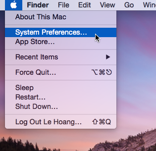
1. Click the Apple logo at the top left of the screen, and then choose System Preferences in the menu.

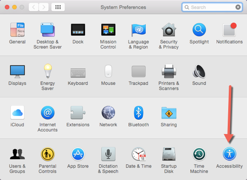
2. In the new System Preferences window, select Accessibility. This option is located at the bottom right of the window in the fourth row. If you do not see a grid of icons, chances are you already have the Preferences window opened. In this case, just click the back button to go back to the full list of settings on the system.

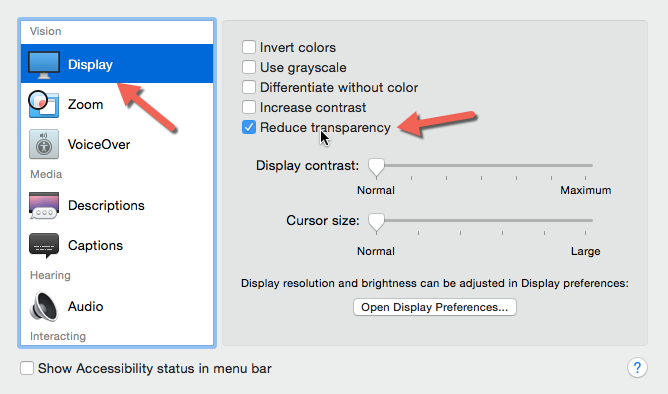
3. Next, choose the Display option under Vision. On the right side, you will see several settings which can be used to change the appearance of elements on-screen. Find the Reduce Transparency option, and activate it.

4. As soon as the feature is turned on, you will see the changes on-screen immediately. The transparent parts of the windows are now a solid white color. If the change is not obvious, take a look at the Dock’s background.
Before:

After:

5. As you might have guessed, turning the Reduce Transparency setting off will revert the change, and the windows will have the same transparency as they did originally. Use it when you need a visual system change.

