Since the screen size of the Apple Watch is small, objects like labels, images, or sliders inside an app are placed below each other. While this limitation means you cannot place objects at the exact location that you want, it is still possible to create a complex layout for your Watch app. Read on to find out how.
Before you start this tutorial, make sure to create a new Xcode project, and add the Apple Watch target to it. You can find the instructions for this task here.
To create a complex layout for an app, we will use a group object. A group object can contain other objects, and you can place them vertically or horizontally.
1. Open the Interface.storyboard file inside the WatchKit app target. In the Object library, search for Group, and drag the object into the blank storyboard.
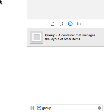
Initially, the new group will be empty. Before we add other elements to the group, let’s take a look at the available attributes in the Utilities panel.
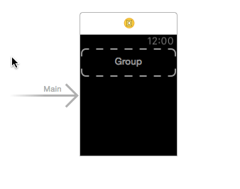
2. One notable attribute for the group is its layout. By default, it is set to Horizontal, which means objects inside the group will be placed next to each other. You can change it to Vertical if you want.
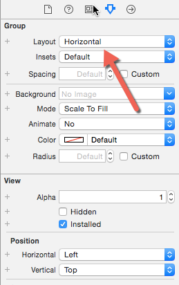
3. Now, it is time to add some objects to the group. In this example, I have added two labels to the group and placed them vertically. You can tell that the two items are inside the group by looking at the Document Outline.
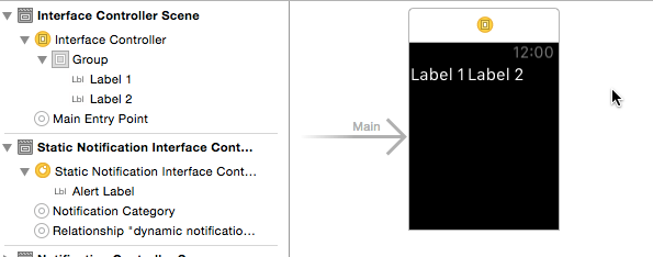
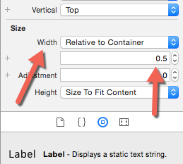
4. One common issue when you use the Horizontal layout in a group is that there may be empty space in that group because there is no object taking up the space. The solution for this is to select the object, find the Width attribute under the Size section, change it to Relative to Container, and set the desired size.
The size of the container (group) is always 1, so a value of 0.5 will make the selected object’s width half the size of the group. In this example, I have two labels. Therefore, a width of 0.5 for each label will make them cover the entire group.
Depending on how many items you have inside a group, you may want to set a different size.
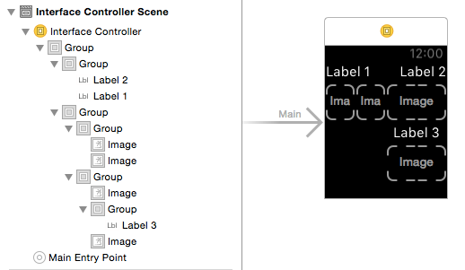
5. It is possible to create nested groups like the example below. When you want to nest a group, drag it under the desired group in the document outline. As you can see, it is possible to create a complex layout for the app even with the limitation of the SDK. However, since the screen of the watch is small, it is not recommended to create a layout that is too complex because users may find your app hard to use.
